Interactive Visualization of the Global Flow of Electronic Waste
Earlier this year we covered , Josh Lepawsky‘s work on “The changing geography of global trade in electronic discards,” which showed that while in 1996, developing countries tended to ship waste to less developed nations, over time the circulation of electronic waste has steadily moved away from that geography until developing countries are exporting to developed nations.
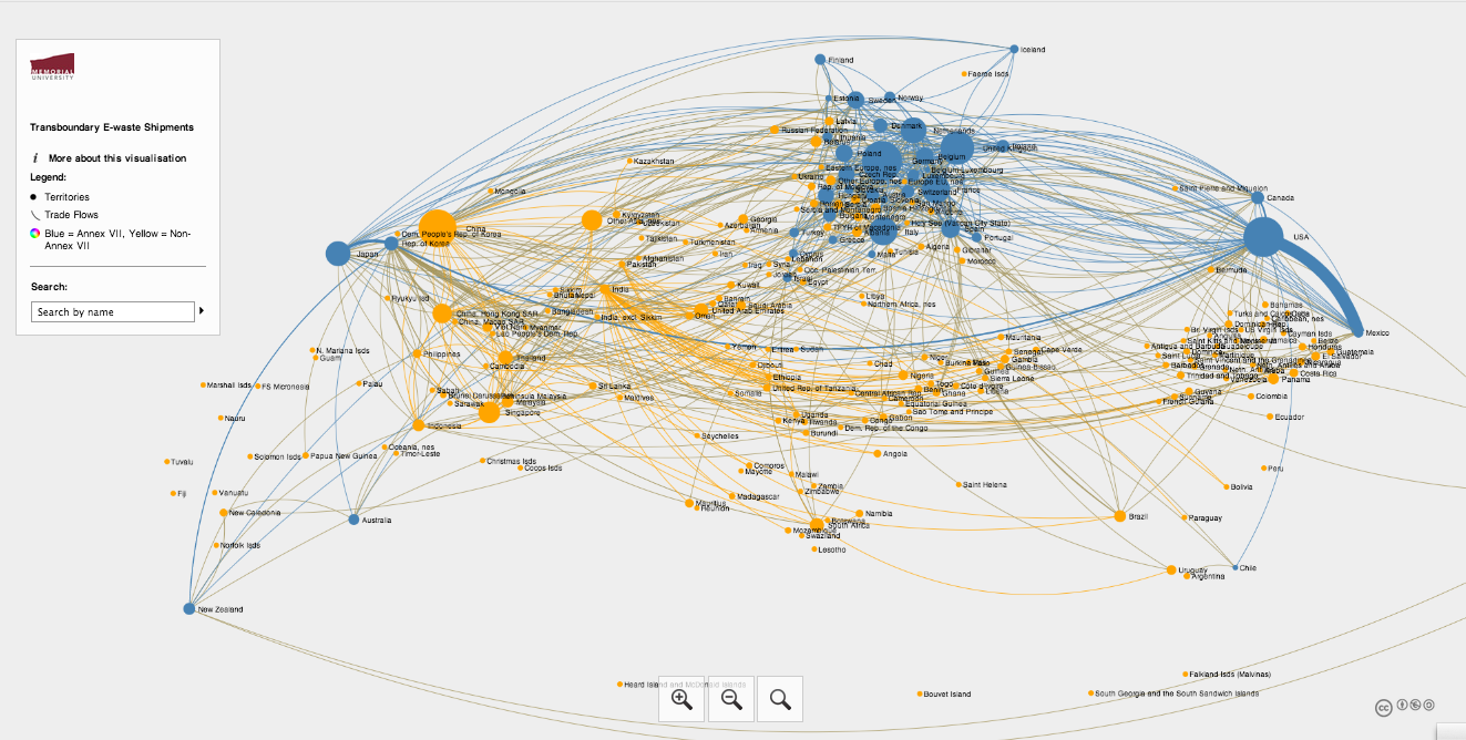
The data that lead to this analysis, over 9400 reported trade transactions from the United Nations COMTRADE database for 206 territories from 1996 to 2012, are now in an interactive format (cartograms) that allow viewers to see transactions 1996, and again in 2012.
What do the cartograms show?
The data are organized into territories and the flows of e-waste that connect them. Territories are colour coded to reflect their status under Annex VII of the Basel Convention (blue for Annex VII territories [developed nations] and yellow for non-Annex VII territories [developing nations]). The larger the circle representing a given territory (e.g., Canada) the more other territories report receiving e-waste shipments from it.
The flow lines depict the volume and direction of e-waste flows between territories. To understand flow direction, follow flow lines in a clockwise direction from one node to another. The thicker the flow lines, the larger the volume of the flow. Currently the software used to create the cartograms (discussed below) does not easily allow labeling of the flows (i.e., displaying the actual number representing the weight of the flow volume).
For more information, and to use the interactive cartograms, see Visualizing Transboundary Shipments of E-waste on Reassembling Rubbish.
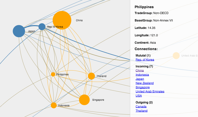
Detail of Philippines.
